Welcome to the third post in the Early Medieval (mostly) Textiles Blog series. This time Dr Katrin Kania, Dr Margit Hofmann and I discuss colours and dyeing silk threads for the Cuthbert Maniple Recreation Project. (Unless otherwise stated, all image copyrights are the authors)
Katrin studied Archaeology of the Middle Ages and Early Modern Time at the University of Bamberg, Germany. She specialised on historical textile techniques and experimental archaeology during her studies, finishing with a PhD on medieval garment construction and sewing techniques. She is now working at a freelancer, running an online shop for historical textile tools and materials as well as offering presentations, courses and workshops on different techniques. She also organises the yearly European Textile Forum, a conference with a strong focus on craft aspects.
Margit is a professional botanical dyer. After training in the UK and France she set up Alte Künste, which focuses on creating high quality, light fast dyes for modern textile crafts. Her major focus is keeping alive and broadening knowledge of historical dyes and plant based dyes. She works with conservators, archaeologists and museums.
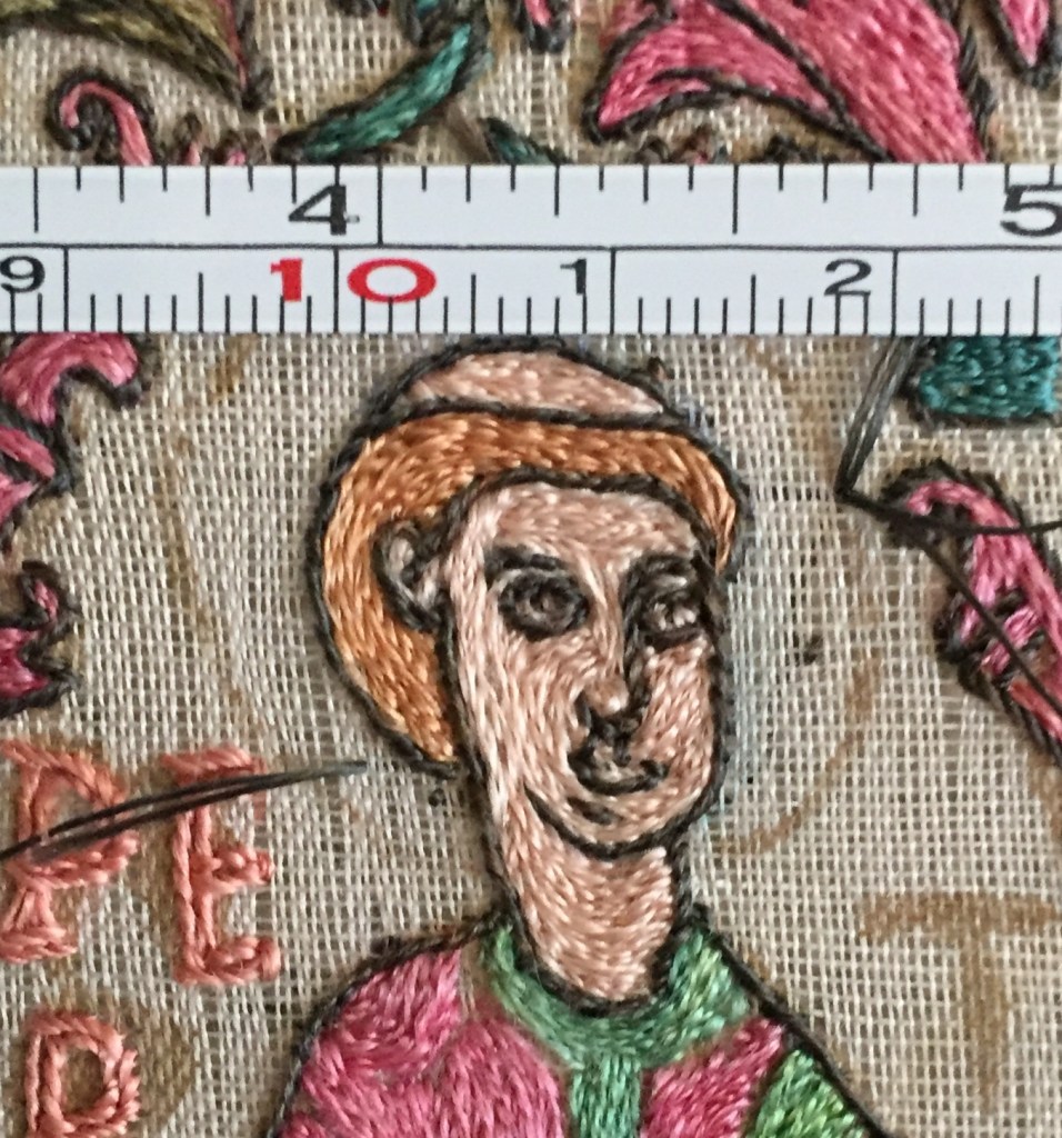
AM: The Cuthbert Maniple Recreation Project is an experimental embroidery project. It uses materials and equipment as close to the originals as possible. The project’s main aims are to make one section of the maniple, investigate working methods, the embroiderers’ decision making and thinking processes and to explore how the maniple would have been engaged with at a multi-sensory level by different audiences. The project is partially funded through a Society of Antiquaries, London, Janet Arnold Grant.
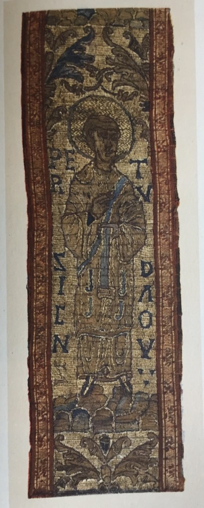
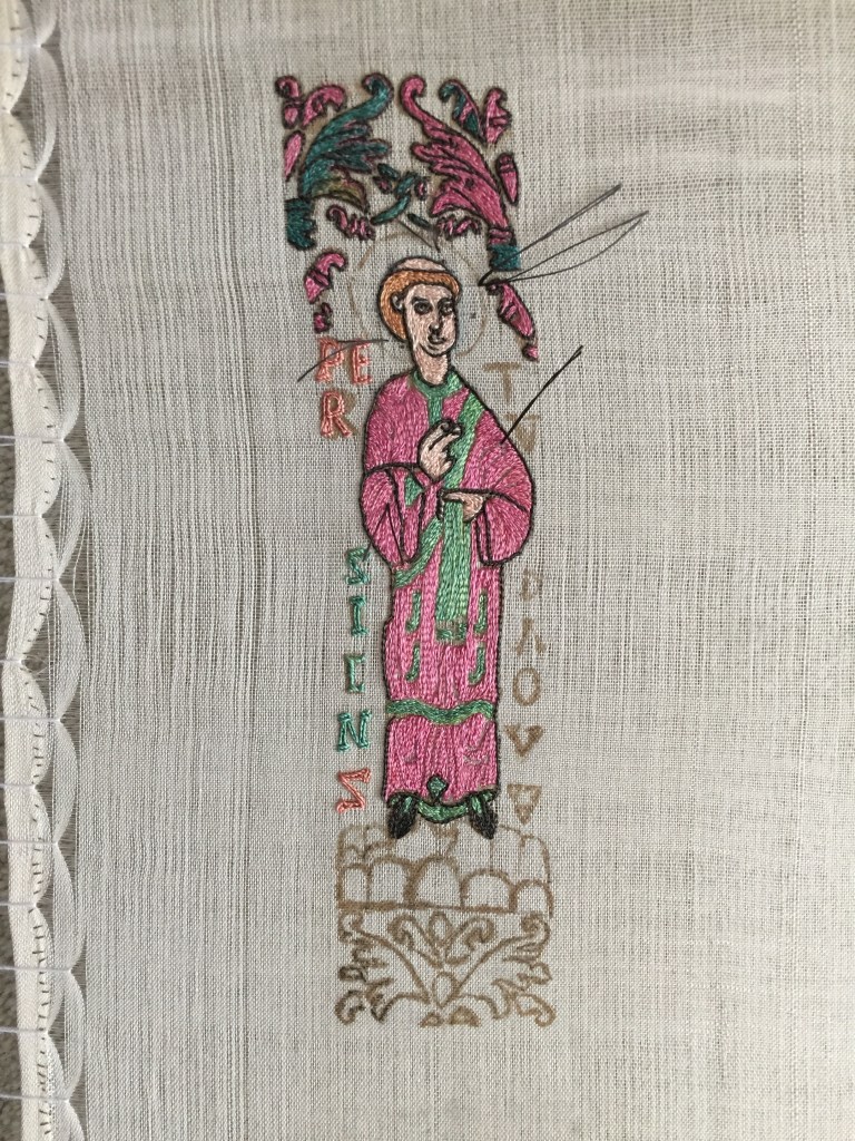
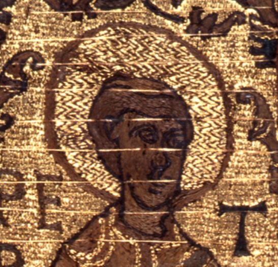
The Cuthbert maniple is a church vestment that looks a little like scarf. It would have been worn over the left wrist by a member of the clergy. It was made in c. 910CE along with a matching stole. It is embroidered with silk and 99% pure gold threads and depicts the full length figures of two Popes and and their Deacons, one on either side of a Dextera Dei (The Hand of God) symbol. On the front of the two end tabs are the heads of St John the Baptist and St John the Evangelist. On the reverse of the end tabs is the embroidered inscription , ÆLFFÆD FIERE PRECEPIT, and PIO EPISCOPO FRIDESTANO, ‘commissioned by Queen Ælfflæd’, ‘for Bishop Frithestan’. However, no-one is sure whether Frithestan, who was Bishop of Winchester, received the stole and maniple set. In 934 King Athelstan took the stole and maniple to Chester-le-Street and gave them to the shrine of St Cuthbert. At some point both vestments were placed in St Cuthbert’s tomb. They were rediscovered in 1827 when Cuthbert’s shrine and tomb, then in Durham Cathedral, was opened. Now they are on display in their own gallery in the Cathedral.
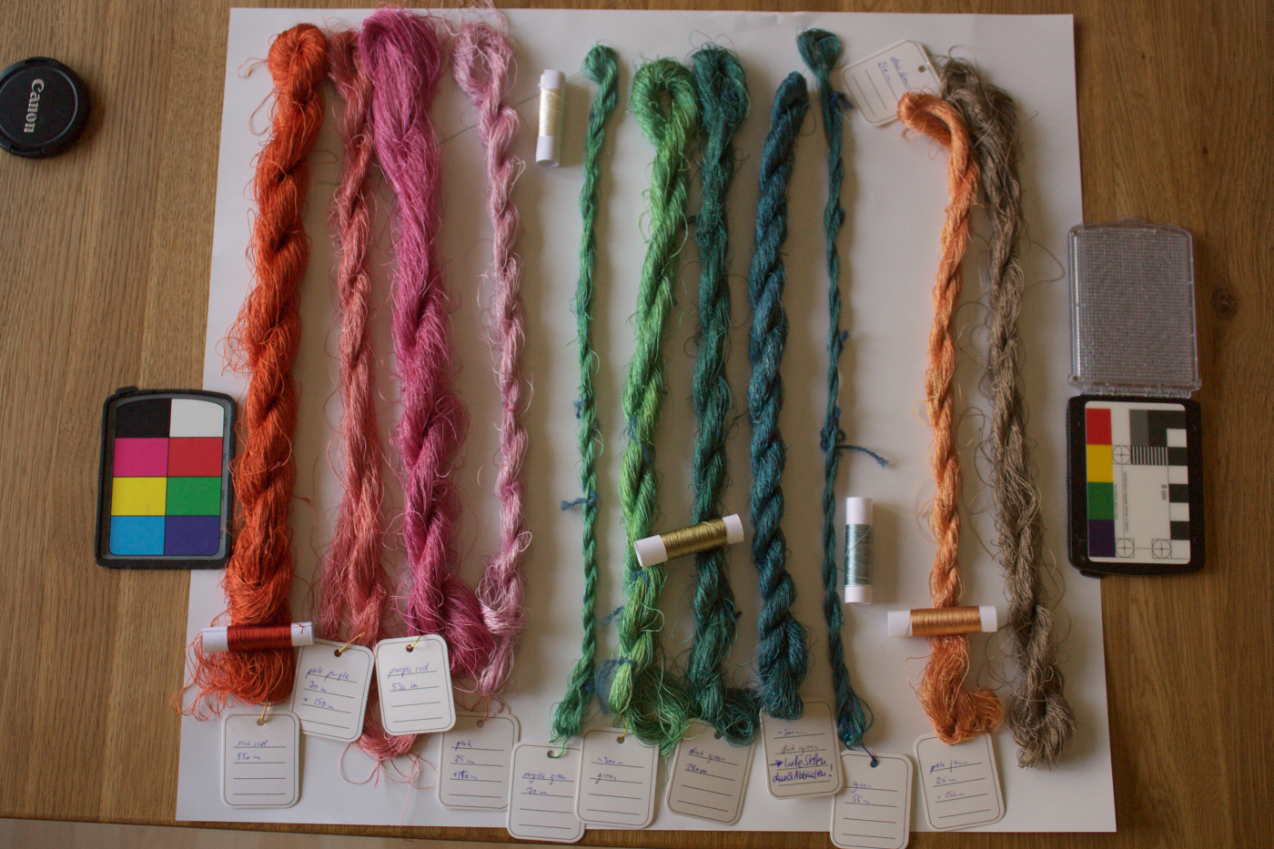
As part of the recreation I wanted to use silk threads that were not only the right thickness and twist but had been dyed to the correct colours, or as close as possible, with natural dyes. This led to a collaborative sub-project with Katrin and Margit. The dye sub-project took nearly a year because of the complex nature of colour and what the name of a colour really means and the dyeing process itself. Here Katrin and Margit tell us a little about these fascinating subjects.
When we discussed the colours of the silk threads and compared them to the names Grace Christie gave them (see the image below), we discovered that there was a difference in what she thought the shade was and our perceptions today, even taking into account the change in the maniple’s colours over time. You mentioned that you’ve come across this in your own work, can you tell us a little about this and how it compares to our experiences on the Cuthbert Maniple Project?
KK: There’s several layers to this question – colours are difficult!
First of all, there can be a difference in how the colours appear today as opposed to when Grace Christie looked at them, due to changes in the textile itself and colour deterioration. There will also have been some change between today and when the maniple was new, as there’s no such thing as an absolutely stable colour, not back in the Middle Ages and not today. So, change over time is one factor, and it’s possible that this took place even between Christie’s survey and our recent one.
A second one is perception of colour. It may well be that Grace Christie had a different perception of colour, and a different reference frame for colour names, than we have. While it’s possible to discern different shades of one colour, it’s not so easy to describe them. We also, as individuals, have a different perception of colours; what I still see as “blue”, you might see as “green”. I have a friend who once told me that she refers to a certain pair of trousers as “green”, though everyone else in her family tells her they’re grey. When both of these issues – description and perception – come together, it can get vastly confusing!
That’s why we have colour charts today, for instance the Pantone palette or the RAL colour charts. When I studied archaeology, I was told that a very handy thing to have was a stamp-collector’s colour book (Michel Farbenführer), as that would allow to describe different soil colours with a colour code. That’s only really useful, though, if everyone involved has the same colour chart.
The third factor is different frames of reference. I was not at all mystified when I saw a shade of blueish green referred to as “porcelain” in a recent catalogue, but only because I come from a region where porcelain is produced, and I have seen the raw mass – which is exactly that shade. For someone only knowing the fired state, though, this colour name is not a very smart choice. Another example: I was wondering for a long time about the colour of gold in the Middle Ages, as the usual (positive, high-quality) descriptor in Middle High German is “red”, which did not fit at all with my personal perception of the gold I knew. Turns out I knew the wrong gold – if you look at a Krugerrand coin, which is gold with about 8% of copper as alloy material, it looks distinctively reddish. My reference frame for “gold colour” was, however, the modern more yellow or white-ish gold variations, made by a different, more popular alloy today.
How do we go about dealing with this problem?
Most of this problem can’t really be dealt with – it’s just something that we have to make sure we’re aware of, and that it gets communicated properly both within the project and, later, through the publications. We’ll never truly know about the frames of reference of the medieval people, or about those of researchers who have since passed away. Frames of reference can also change over time, so the same person might describe colours differently 20 years later. We also cannot estimate exactly how a colour looked when it was new, as there’s too many variables in a natural colour that will influence how it ages. So much of this is, and remains, guesswork.
What we can do to make things easier for future researchers is document colours as much as possible with a fixed reference frame. That can also help with screen calibrations, a common issue today when looking at colours in digital sources. Taking photos with an RGB tool is one way of including a frame of reference; these are available in photography shops. Other colour charts can also be used, of course – the more widely available or accessible these are, the better.
Most colour charts are, however, not easy or cheap to get, as printing the exact colours is a difficult process itself. Because accessibility to the reference is key for this to work, I’ve come up with using Euro banknotes, folded and stacked so you can see the colours of the different notes, as a colour chart. Since printing money is a process that is definitely very closely controlled, the colours will be similar enough on the notes for all practical purposes.
MH: To add to what Katrin said on colour perception over time. One way to approach historic naming of colours is to use historic dye recipes and then compare the resulting colours to how they were named. This gives some clues if the modern naming differs significantly from the historic.
How did you go about finding the right dyes and processes for this project? Did it differ in any way to other projects you’ve undertaken? How?
MH: We had Grace Christie’s description and your colour outline to start with. The next step was to consider the date of the Cuthbert maniple and define the range of dye plants available then. That way we excluded all dye plants native to the Americas, Oceania & the Pacific as well as the more exotic dye plants from Asia right from the start.
Of course, all fugitive [none dye fast] dye plants got skipped as well. No historic dyer would have used a fugitive dye plant for embroidery silk because silk was, and is, far too expensive to waste with low quality dye and secondly, as embroidery the silk is combined with other dyed silk, as well as the ground fabric [fabric on which the embroidery is worked]. Therefore, re-dyeing a fugitive silk [silk that’s lost colour] was out of the question. This project differed from my usual dye approach in that we were aiming at a very specific range of shades. This is not my standard approach for modern yarn dyeing. I usually work the other way round: I start with specific plants and then work with the shades they give. Here the shades were defined first, which resulted in a kind of probability assessment for which plants and sequence of plants to use (see below).
Probability Assessment
We already knew that modern language & labeling would not lead to the expected results. So, we took this into account. As it is with a re-construction, we were working backwards from intended shade to the dye-recipe to reach that shade. I was sure how to reach some colours, others – especially with only small variation between some shades – were trickier as they still had to be distinctive enough for the eye to discern them.
My approach was a kind of probability assessment: for each colour I had various dye recipes. I ranked them, starting with the one we expected to give the closest result and ending with the least likely but still within a reasonable range of the intended shade.
That way – in case our expectations were not met by reality – we could switch to a different recipe. Especially if it was a sequence of dye-baths and the first one already did not bring the needed colour at that point of the process; the following steps would not change that. So, we could switch to different recipes early on and did not have to start from scratch.
We had one case where the results of two different dyes were too close for the planned use in the project – so we re-calculated & re-dyed one colour to be more distinct from the other. Which is what the original artist creating the maniple would have done as well: choosing from a range of available shades the one that fit best the intended use.
Can you describe the process of dyeing the threads?
MH: It was a classic approach to dyeing silk.
First, wash the silk threads to make sure they are properly de-gummed, as well as removing whatever remained on the silk from the yarn-making process.
Then followed a sequence of mordanting and dyeing. Depending on dye plants and intended shade these could add up to several mordanting processes and up to four dyeing sessions. To increase colour depth and the stability of the chemical bonds between mordanted silk and dye, the threads would usually stay in the dye pot until the liquid had cooled. But I remember one case where we wanted a rather pale shade from a usually very aggressively colouring dye plant. The best method for such a case is to remove the silk from the dye-bath as soon as the intended shade is reached (always taking into account that the colour of wet silk looks significantly darker than dry silk). The dyed silk then gets placed in a water bath of the same temperature as the dye-bath and stays there for up to 1 hour. That way the chemical bonding between silk and dye-colour can fully develop without more dye accumulating on the silk at the same time (as would happen if the silk had stayed in the dye-bath).
How did you get the different shades / right tones / depth of colour?
MH: There was a whole range of parameters that went into defining how to reach the intended shades.
On top of what Katrin already mentioned the factors that were important from my side were mostly:
a) I already knew from previous experience that the sequence in which different dye plants are used on the same fibre results in different shades of the final colour. We used this intentionally to reach specific shades.
b) Natural dyed silk tends to have significantly paler results than the same dye on wool. This needed to be taken into account when aiming for specific shades and colours. Increasing dye-material or time in the dye bath usually does not increase the colour significantly. It is more helpful to switch to different dye plants or to a sequence of various dye-plants to reach an intended shade.
c) Besides the tendency to paler shades, the shade of colour silk takes from some dye plants is significantly different to wool. As with the previous point, experience as well as expectations from dyeing wool cannot be fully transferred to dyeing silk. That is something I learnt very early on, when I started dyeing pure silk years ago. And I was relying on that experience when working on the actual dye-processes for each shade of the Cuthbert maniple.
What happened after the dyeing process?
MH: After the dyeing process I let the colours set on the silk threads. There are differing methods out there for handling freshly dyed fibres. My experience is that it increases the quality of the dye significantly when the fibre is left to dry with fresh dye for some time before washing. I am aware there are sources discouraging that. I cannot confirm this.
How did you prepare the threads after they had been dyed, ready to send to me? Why did you do what you did?
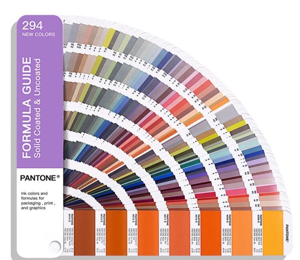
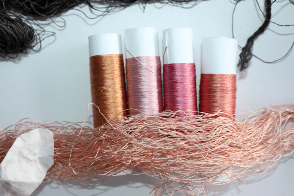
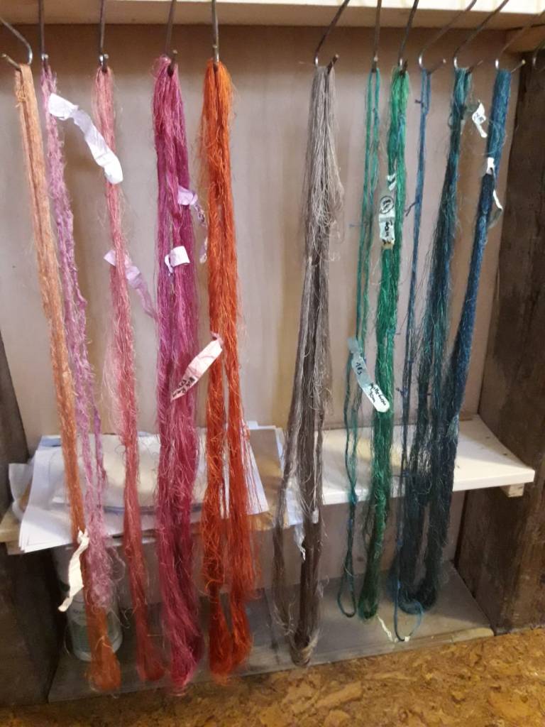
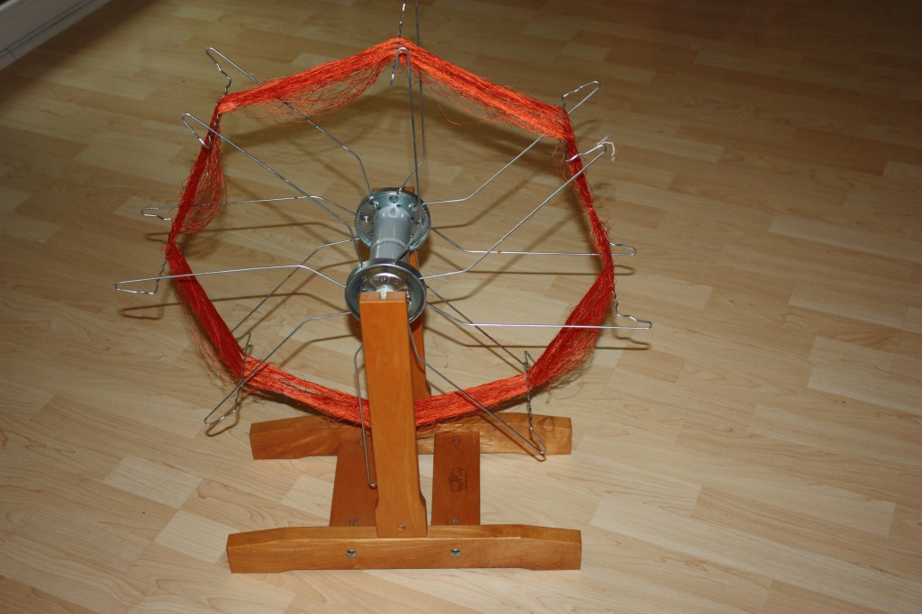
KK: I reeled off the threads from the skeins they had been dyed in, winding them onto spools for storage. Then the portions for the Cuthbert project were measured off and wound onto spools to send to Britain. Even with very careful handling of the threads, they tend to get a little disorderly in their skein, so re-winding them for easier handling has proven to be a good thing in general.

One of the most important aspects of this project, and particularly this part of the project, is the collaborative work. How do you feel about this, particularly in relation to this project?
Has it helped develop greater understanding of past / lost processes?
MH: One huge insight for me was to understand how modern sources on historic dyes and their wide-spread availability has influenced our modern awareness of natural dyes. We had a fun discussion on the darkest shade of black in the project. It boiled down to the question of using walnuts or not. I was firmly against this as dyeing black historically was a branch on its own in Europe and the recipes for high quality black were not walnuts. It was fun because I am sure the uniqueness of equating walnut with good black dyes is a modern development: Black walnuts (Juglans nigra) are native to North America and this type of walnut does indeed make an awesome black botanical dye. But our European version of walnuts needs some heavy tampering with modifiers to get to a black shade that usually weakens the fibre in the process. It was therefore a cheap and unfortunately rather low-quality dye. I heavily doubt that would have been used for embroidery silk.
In the end we did both: dyeing with European walnuts (plus heavy tampering) and the traditional way of over-dyeing red with blue for direct comparison. European walnuts did not make the cut.
Collaboration to achieve the right results?
MH: Be open to skip what you had planned for vs something that actually works.
Also: do not get too attached to your own beliefs and rather go for trying things out.
How did distance affect collaborative working?
KK: I’ve been working together with dyers over distance for many years now, and it does get easier with practice. Reference colours do help, and you’d need those anyways, when talking about a specific shade. It also helped that I know Margit’s range of colours from her knitting yarn stock, and about the shade variations possible with a single plant. We sent a lot of pictures back and forth as well, and discussed things via phone.
MH: Adding to what Katrin said, it helped that we have worked together in the past already. We had some idea how the other perceives and names colours. This reduced the time to a mutual understanding significantly; and it helped us to realize early on (before the actual dye process) when we were using the same or similar words but meant different things.
Did modern technology help at all?
KK: Of course, modern technology did help – sending a photo was never as quick and easy as in the time of instant messaging. Discussions by phone to clear up details, and group discussions by email were key to get things sorted out, and of course much quicker than writing letters and collecting and spreading the individual answers.
What helped most, though, was a solid understanding that the outcome of the dyeing will be a range of shades that should be different enough from each other to be distinguishable and thus do the job of creating a legible embroidery, but that there is no specific utterly exact outcome that has to be reached. That is just not possible with dyeing. It’s not even possible with modern chemical colours, as you can clearly see from the admonishment on every ball of knitting yarn to only use yarn from the same colouring batch in one project – and with natural ingredients and their much greater variation in chemical contents, that way madness lies.
MH: All that Katrin already mentioned. Plus, from a dyer’s perspective, modern technology is a blessing. We have protection, gloves, dust masks that historic dyers could not even dream of. Also, thermometers and electric heating for dye baths make my life as a modern botanical dyer much easier.
Thank you
I would like to thank both Katrin and Margit. I hope this admittedly short interview has given some insight into the collaborative sub-project the dyeing process became, along with its complications, the dyeing process and the excellent results. Next month Dr Karen Carr will be talking about the availability of steel needles and the contribution they made to embroidery, including Coptic and Chinese, in late Antiquity.
Contact: If you would like to contact either Katrin or Margit about their work, please use one of the links below.
Katrin:
Email: katrin.kania@pallia.net
Instagram and Twitter: @katrinkania
Margit:
Email: http://www.altekuenste.eu/en/contact/
Instagram: @altekuenste
Publications and Useful Resources:
Katrin: https://www.pallia.net/en/main-page/bibliography
European Textile Forum homepage: www.textileforum.org
pallia homepage: http://www.pallia.net
Margit: http://www.altekuenste.eu/

Big fan of experimental archaeology here! This was a wonderful read, and bravo to the hard work and knowledge both ladies have brought to the project! Are you just experimenting with the embroidery, or do you plan on making a full reproduction with the brocaded tabletwoven bands?
LikeLike
I’m glad you enjoyed it. Both Katrin and Margit are amazing!
At the moment I plan to get the embroidery finished (the project is way over due but so many other things keep getting in the way!) and write this part up. Hopefully it’s also going on display with an accompanying lecture and workshop, but they’re in the preparation stage at the moment. Eventually I’d like to complete the whole thing including the tablet-woven braid, but I think that’s a way off at the moment. I’m absolutely rubbish at tablet-weaving so it’ll mean asking someone to make it for me or for me to really get my head round the process first. I’ve got a friend who’s said she’s interested in having a go, so watch this space!
LikeLike
Excellent interview. Really enjoyed learning about the challenges of getting the colours “right”.
LikeLike
Thanks! Really glad you enjoyed it and found it interesting
LikeLike
Are the vivid colors visible on the back, or are you “winging it” based on dyestuffs present and predictable (mostly) color fading.
There’s another “color card” similar to what you mentioned. It’s used in Fungal taxonomy.
LikeLike
Hi, are you referring to the dyes for the Cuthbert Project?
If so, we have no images or data for the colours on the back. When the pieces were ‘restored’ in the 19th century, silk backings were glued to the embroideries and they haven’t been removed since.
I wouldn’t say we’re ‘winging it’ as we’re using all the available evidence and knowledge of dyes and the dyeing processes etc to produce the colours. Obviously with this sort of thing, future scientific techniques may show something completely different…
LikeLike
Yes, I did mean the Cuthbert pieces. Sorry that I didn’t make myself clear. Sometimes, I get excited and forget that I haven’t said things.
I’ve never been able to spend any time with such old textiles other than in photographs, and the vividness of your color choices just blows me away. They are, however, very reminiscent 0f the colors in the Maaseiko pieces, so I shouldn’t be too surprised. 🙂
LikeLiked by 1 person
“Thank you for this insightful post on early medieval textiles! The detailed exploration of historical fabrics and their significance is truly fascinating. Your research and presentation bring a deeper understanding of textile history. Looking forward to more of your intriguing content!”
LikeLiked by 1 person